Zdrowe Zakupy · Building a better product base for the grocery companion app
My team and I redesigned the new product submission process for Zdrowe Zakupy, a barcode scanner app that shows a health score based on ingredients, additives, and nutrition values.
The starting point
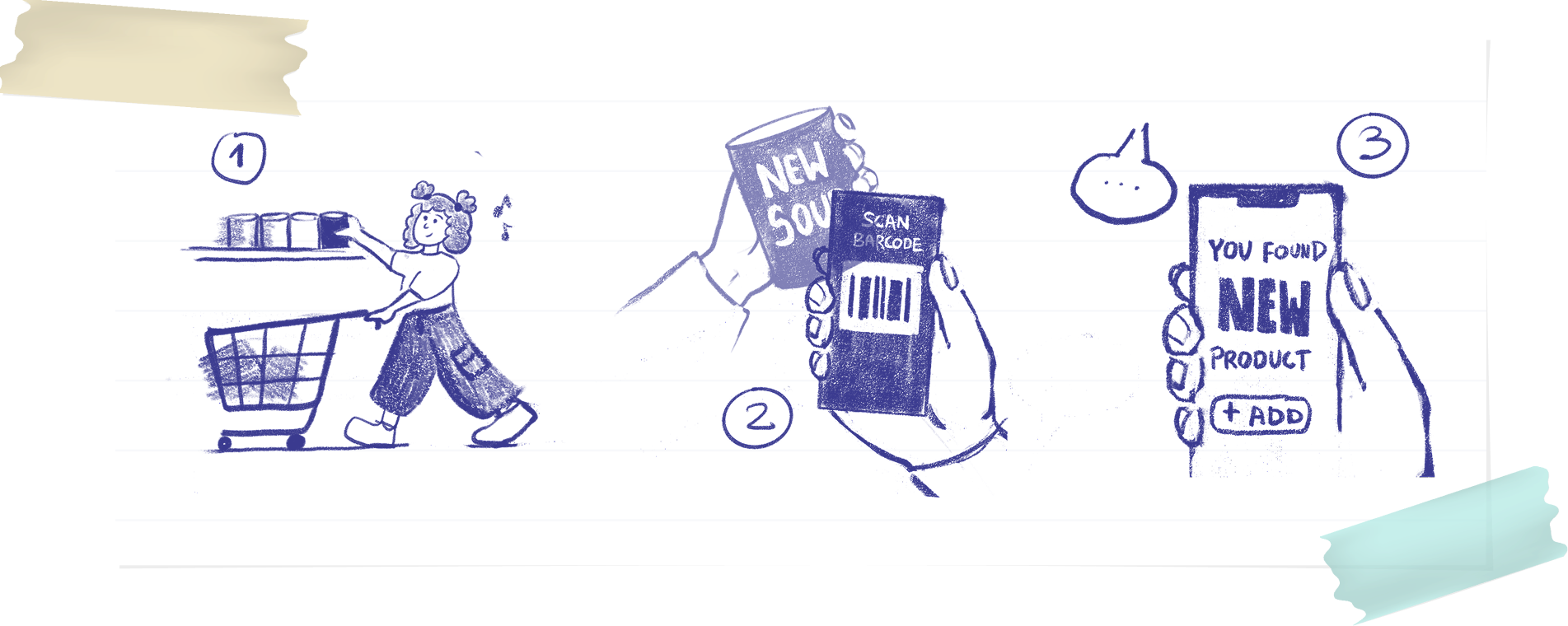
With grocery stores constantly rotating and expanding their shelves, users were hitting a blank "new product" page on roughly every fifth scan.
Zdrowe Zakupy lives on its database — if a product isn't in it, the app can't show a score, and the core promise breaks down right when someone is standing in the aisle deciding what to buy.
Adding a product was too much work
The existing flow asked users to type out the full ingredient list by hand. For a product with 20+ ingredients, standing in an aisle, holding a basket, squinting at tiny print, this took several minutes and required real commitment. Mistakes crept in, injecting bad data that frustrated everyone downstream.
What's more — missing products were, unsurprisingly, the most common complaint in app store reviews.
How might we ensure users can reliably find newly launched products in the app despite frequent changes in store inventory?
How might we streamline or automate product submission and review to minimize delays and errors in adding new products?
Key research findings
We looked into the qualitative data and conducted a few interviews with power users to get a deeper understanding of the problem. It became clear that users needed the value instantly, instead of getting a "new product" screen. They were fine with occasionally adding a new product themselves — but they also needed to receive the score information back while they were still at the shop.
People don't read while shopping
Any screen requiring more than one line of instruction was skipped. The flow had to be self-explaining through visuals alone.
Everyone wanted to photograph, not type
Without prompting, every interviewee said "can't I just take a photo?" — it's how they already save information on their phones.
Uncertainty killed motivation
After submitting, there was no feedback. "Did it go through?" — the silence felt like failure, so people stopped trying.
45 seconds was the ceiling
If it took longer, users put their phone away. The in-store context is unforgiving.
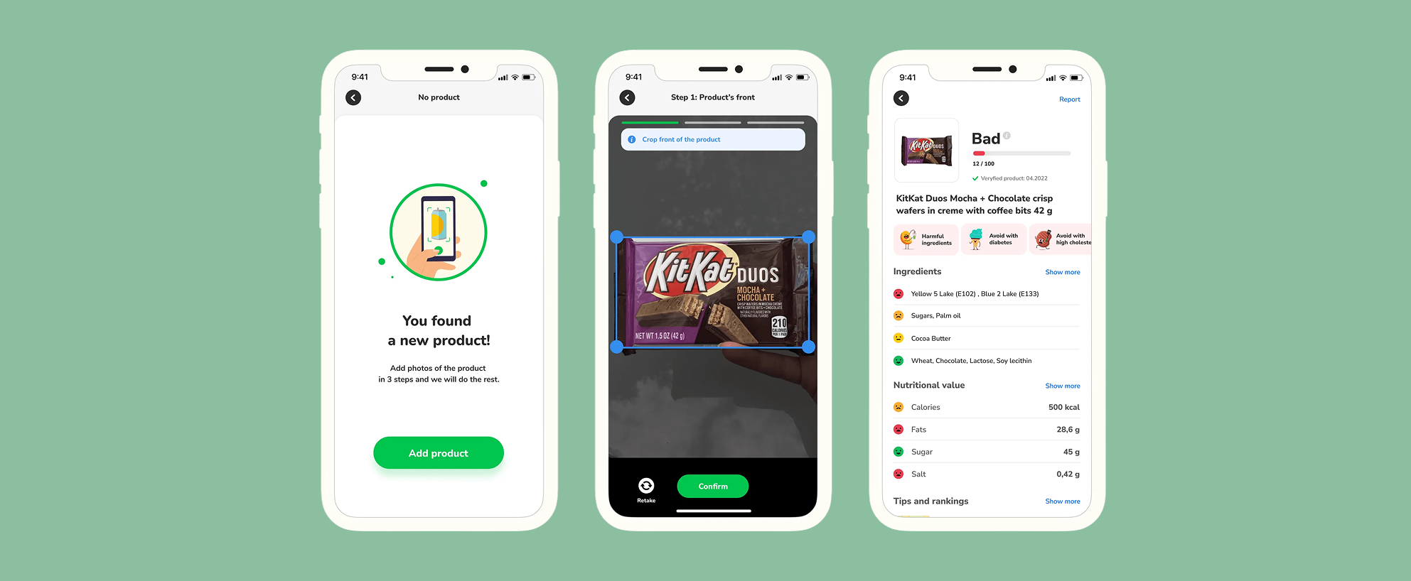
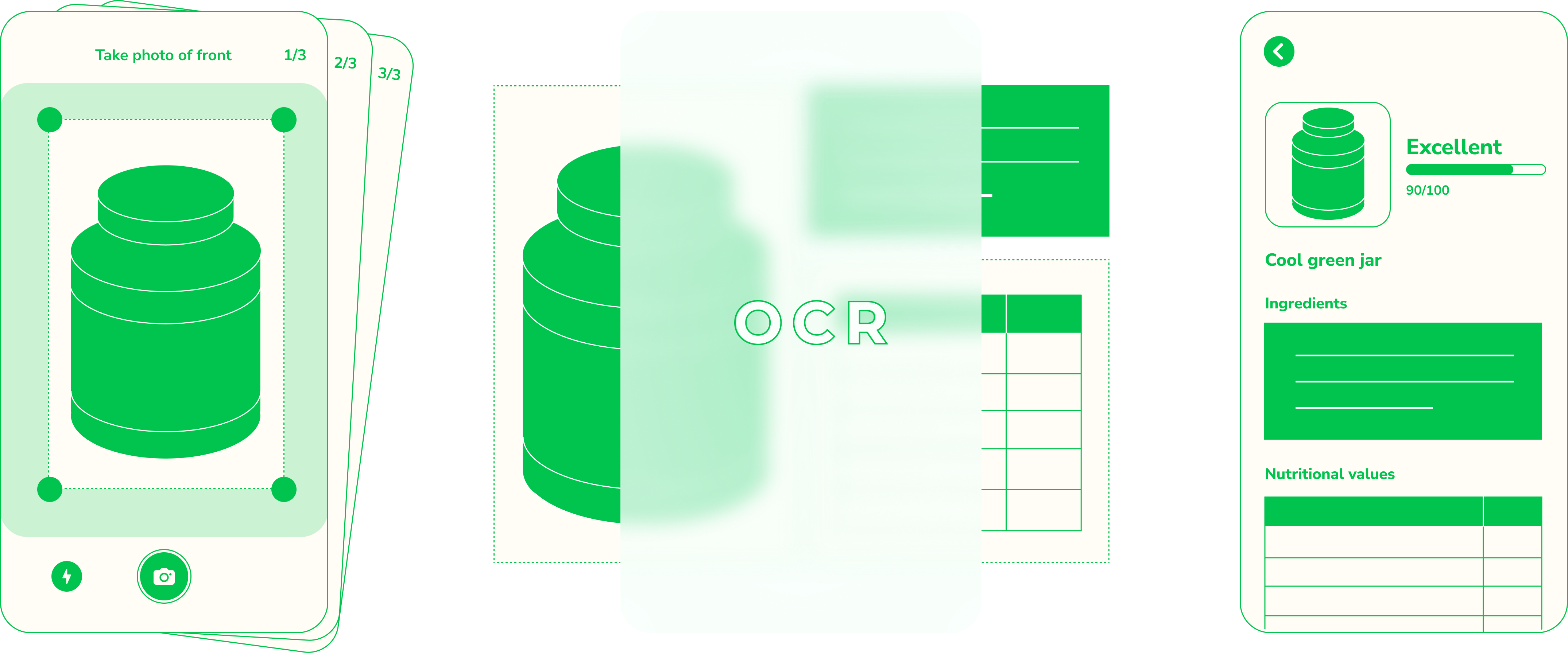
Three photos instead of typing
The redesigned flow replaces all manual entry with three photographs: product front, ingredient list, nutrition label. A backend OCR system extracts the data. Users contribute without typing a single character.
How it works?
Scan detects a missing product
The user is asked to add 3 photos to add the product to the database.
Three guided photos
Product front, ingredient list, nutrition label. Visual overlays show exactly what to frame.
Submit and wait until the magic happens
Photos go to the backend. OCR extracts everything. Under 30 seconds total.
Push notification closes the loop
When the score is ready, the user gets notified. Their scan now works.
What we learned after 30 days from launch
In the first 30 days we approved about 800 products
It was about 5% of no-product-view from that month. So the no product view dropped from 20% to 15%.
95% of photos were correct and, in fact, didn't need our approval
We were scared that users would send inappropriate photos. But it didn't happen.
The average time of submitting a new product dropped from 1.5 min to 0.36 min
Even if 3 photos sounds like a lot, it's still smoother than the previous flow.
Next steps
Improve approval speed
We did everything we could, but some users complained that they had to wait several days for the approval.
Remove cropping step from every photo
Some users said the process was still long and they'd like to make it even faster — we decided to eliminate some of the steps.
Onboarding process
About 30% of users didn't notice that this feature had changed, so we should think about an onboarding process.