
Blix is an aggregator of leaflets and promotions that helps people save time and money in stores. It is already an outstanding performer, with 4M monthly active users.
To enrich that experience, I designed an MVP expense-manager feature: a way to photograph receipts and instantly see where the money actually went.
Covering the moment after shopping
Blix has a lot of dedicated users doing everyday grocery shopping with the app. They look for the best promotions on their favourite products and build shopping lists. To round out that experience, we needed to think about the post-shopping moment too.
We decided to build an MVP of a new feature: an expenses manager.
An MVP that learns to read receipts
Our users already enjoyed the shopping list. To make the shopping experience even more complete, we looked at adding the ability to collect and analyse receipts.
The primary business need was to test the feature in a way that could later enable cashback: build and publish an uncomplicated version that would teach us to read and correctly interpret real receipts.
- Instant analysis of the receipt as a chart, so users know exactly what they spent their money on (using OCR).
- A month-to-month statement, in this MVP version.
- A single place to store all receipts.
Correct and complete reading of 90% of the information on the receipt.
Competitors and real receipts
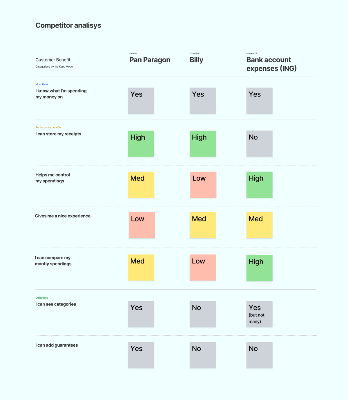
Before designing the flow, I mapped how existing tools in the category stacked up: a receipt-scanning app (Pan Paragon), a budgeting app (Billy), and bank-native expense tracking (ING). I scored them against what users actually valued, using the Kano model.
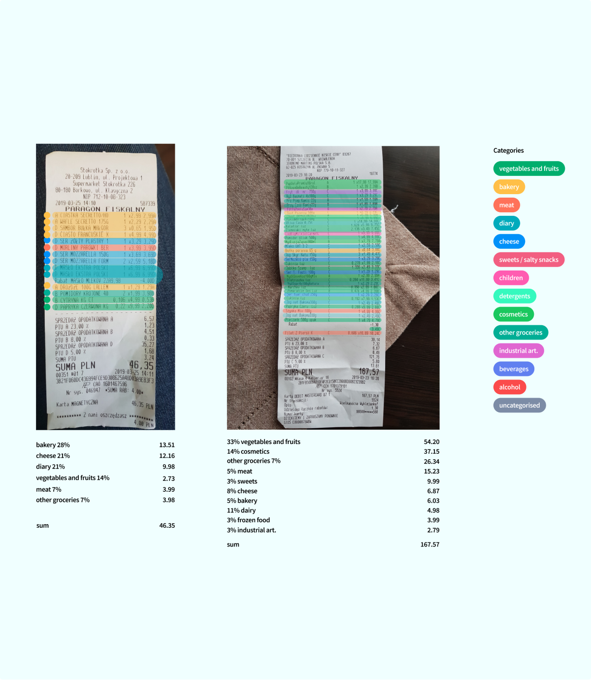
I also tested the categorisation logic against real receipts from users, manually tagging line items to see how cleanly they’d map onto spending categories before any OCR was involved.
Receipts and expenses as two simple screens
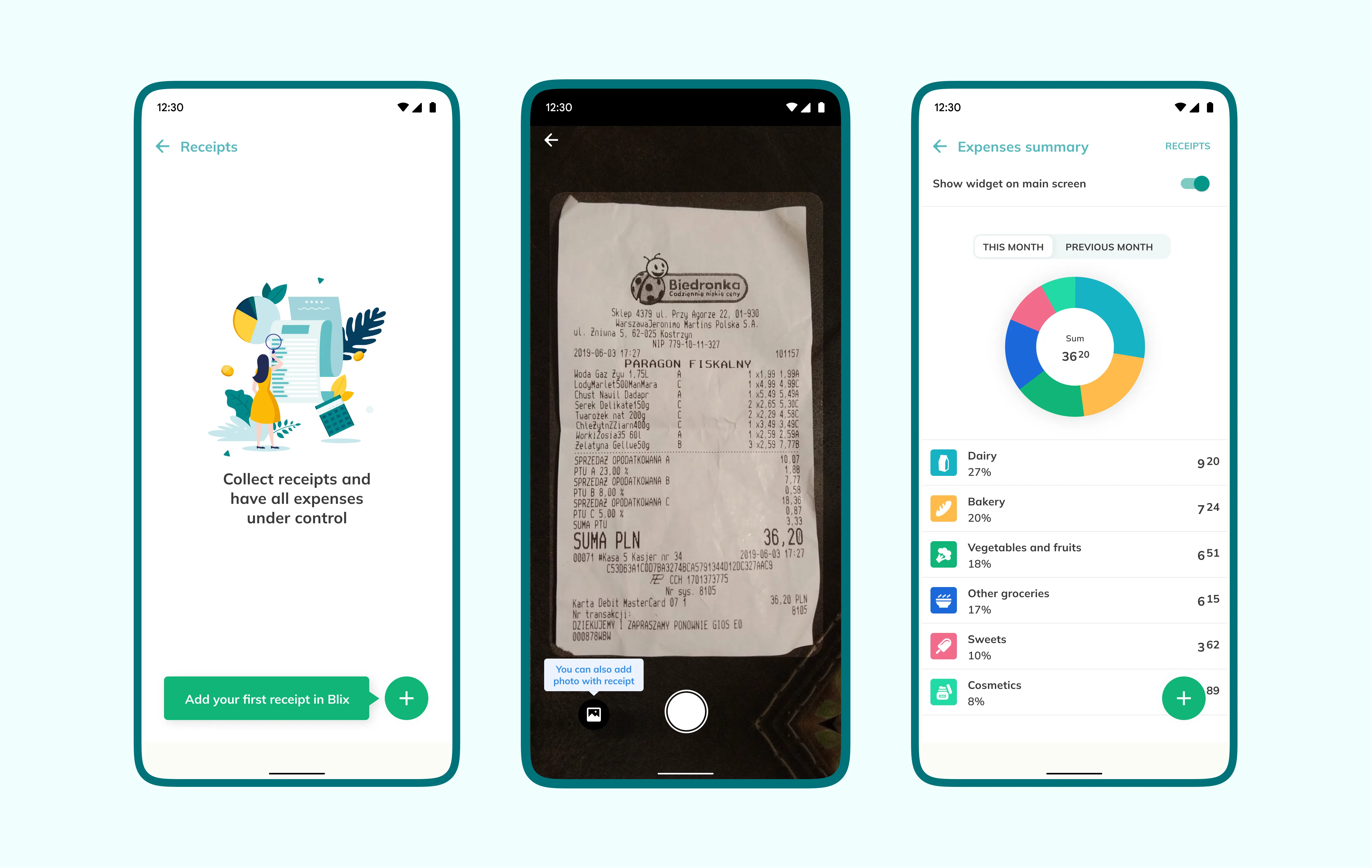
Moving forward, we decided to show receipts and expenses as two separate, simple surfaces rather than one complex screen. This matched the MVP’s goal of testing the core idea, not shipping every feature at once. Below is the empty state of the expenses view, and the process of adding the first receipt.
We added a simplified divider between this month’s and last month’s expenses as an MVP version, a quick way to compare spending across months.
Put together, the whole flow goes from an empty receipts list to a categorised, chart-based expenses summary.
The MVP let Android users collect data from their receipts. It read the information on them correctly 82% of the time, against the 90% we had set as the OKR.
82% of the information on receipts read correctly.